
Not sure if you still need property brochures? The vast majority of potential buyers may start their house hunt online, but as we covered in our recent blog post, property brochures are still essential when it comes to modern marketing. But what exactly is it that makes a good property brochure?
These days, you can drop your photos and text into a template and have it sent to the printers with the click of a button. It may be quick and easy, but it lacks the real wow factor of a bespoke, beautifully designed product.
The best property marketing involves creating brochures on par with those designed by high-end hotels, cars and other luxury brands. After all, the biggest purchase anyone is ever likely to make is their home. Here are a few things to consider for your next instruction.
Photography
Good photography is a major selling point of any brochure, and property is no different. You could have an outstanding layout and the finest quality paper going, but if your photographs aren’t up to scratch then you are missing out on a big opportunity.
There’s a lot to learn when it comes to taking a good property photo, but for the best results every time it’s worth investing in professional photos. Property photographers are trained in the best angles, composition and lighting for homes of every shape and size, and can ensure that your properties are always looking their best. Here at CJ Property Marketing, we even include blue sky editing as standard, and deliver the finished product straight to your inbox within 24 hours.
For certain properties, you might also like to branch out with more creative photography like twilight, lifestyle or drone shots. Images like these will really help your property brochure stand out. To find out more about these types of photography, take a look at our blog post ‘Using Creative Photography To Market High Value Homes‘.
Copy
It’s easy for property copy to come across as a bit clinical – more along the lines of a list of features rather than a warm and aspirational description of someone’s home. Good property writing doesn’t just sell the house itself, it sells a lifestyle, so while it’s important to get all those key features in, a little extra effort can go a long way.
If you aren’t in a position to hire a professional copywriter, there are a couple of things you can keep in mind to make sure you’re creating copy that sells. The Features + Benefits formula is a great rule of thumb to help keep your writing on track. This simply means that you list a key feature first, and then elaborate with its benefits. Here are a couple of great real-life examples of this that we found on Rightmove, and why they work so well.
“The engineered wooden floor in the reception has underfloor heating, giving a warm start to every day”
The addition of the benefit (‘giving a warm start to every day’) helps to paint a picture for prospective buyers, allowing them to imagine themselves waking up each day to the comfort and luxury of feeling warm underfoot. Once a buyer is able to imagine themselves in the property, they will be one step closer towards picking up the phone. It’s just one small addition, but it makes a big difference to the overall effect of the copy.
“The well-proportioned reception room provides contemporary living space while allowing the occupier the chance to display a range of art”
Think outside the box when it comes to the features and benefits of a property. This home was situated in an expensive part of London near a large number of high-end art galleries. The benefit included here (‘allowing the occupier the chance to display a range of art’) may be niche, but it caters directly to the kind of buyer that would be perfect for this property.
For more copy tips and tricks to include in your next brochure and your property descriptions, head over to our blog post ‘How To Write Property Descriptions That Sell‘.
Floor plan
If you’ve read our blog post about floor plans, you’ll find out why it’s so important to include them in your listings (including a surprising statistic from Rightmove). Well, the same can be said for property brochures.
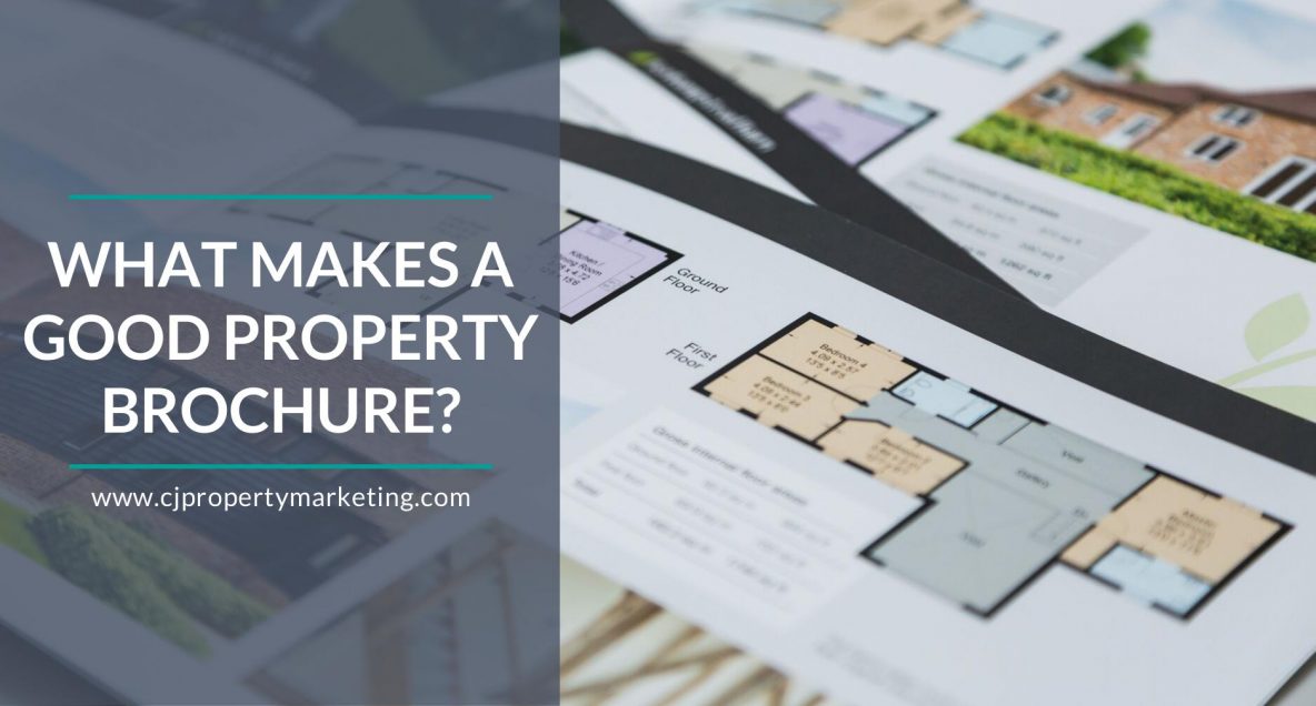
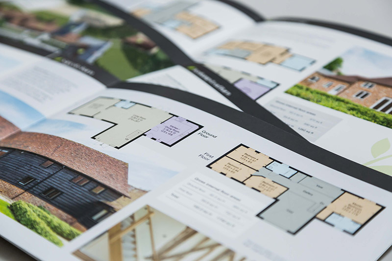
An easy-to-interpret, well-designed floor plan makes it easier for potential buyers to see the size and scope of the rooms. This is particularly true when presented alongside property photos. Most people ask to see the floor plan before they purchase a property, even after they have viewed it. By featuring the floor plan in the brochure, you are both saving time and making it easier for buyers to make their decision.
And just because it’s a floor plan doesn’t mean it can’t look good. Floor plans can all be customised to fit in with the colour scheme and style of your brochure and can even be transformed into an elegant 3D plan complete with furniture to help buyers to visualise the space.
Map
A key selling point of any property is its location, so if you’re not adding a map to your brochure you may be missing a trick. A location map will give potential buyers a better idea of the area as a whole and where the property is situated, and you can even zoom in on the area to show off the amenities, schools and train stations within walking distance. It only takes up a small area of your brochure, but conveys a huge amount of useful information.
An area guide to accompany the map can really emphasise these key selling points and, with a bit of creative copy, also paint a picture of what living in the area will be like. As with the photos and description, this is all about helping people to visualise themselves in the home.
Colours
It’s best to stick to a minimal palette of just two or three colours to stop your brochure from looking too garish or overwhelming. But that’s not to say you can’t go bold with your colour choices. As with most other elements of your design, it really depends on the property and what will work best for your ideal buyers. While monochrome may work well for a high-end, luxury development, warm, earthy tones might be the best choice for that beautiful barn conversion.
So while the choice of colours is completely up to you, a good rule of thumb is to avoid pairing two light colours or two dark colours together. Contrasting colours will have a higher visual impact and help keep potential buyers interested in your brochure.
Branding
The aim of a brochure may be to help sell a property, but that’s not to say that it shouldn’t also showcase your company. You don’t need to be too in-your-face about it. Small details like including your company logo and contact details make a brochure instantly recognisable as your own.
When you have put extra effort into making sure you produce the best possible quality brochure, you want people to be able to easily know where it has come from. This can be a great marketing tool for potential future clients, particularly as property brochures tend to be seen by numerous different people and are usually kept around for a while.
Paper
A big part of a property brochure’s appeal is its tactility, and the paper you choose can really change its overall look and feel. From the weight of the paper to its treatment (glossy or matte), it all contributes to a buyer’s first impression once they have the brochure in their hands.
How do you want the property to feel? Is it affordable or luxurious? Cosy or contemporary? The choice of paper may seem like a minor decision, but it’s well worth putting some thought into.
Final Thoughts
Beautifully designed property brochures form the foundation of all the marketing and promotional activities for your properties. They also help to bridge the gap between the first glimpse and the final sale. There’s a lot to consider, but once you get them right you’ll get fantastic results for both you and your clients.
If you’d like a helping hand with your property brochures, feel free to give us a call on 01494 358 888 or email info@cjpropertymarketing.com for an exploratory chat.


